PRE|SETS











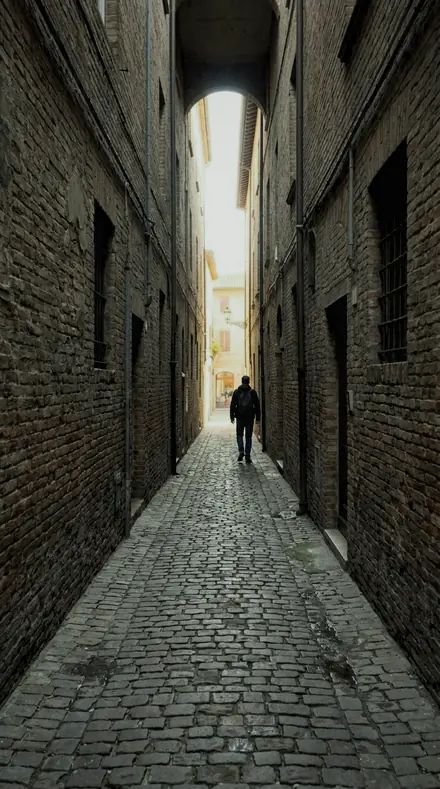
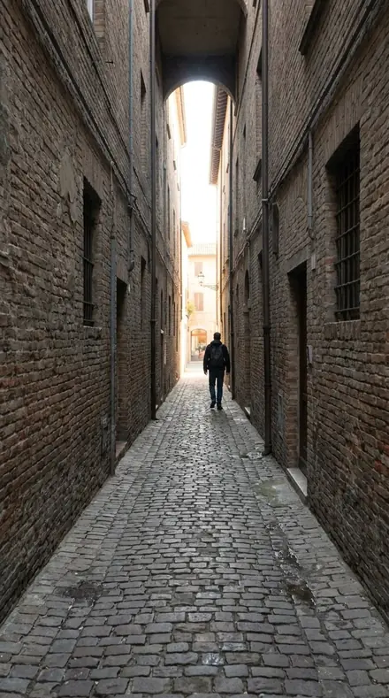


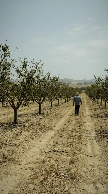
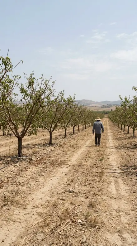

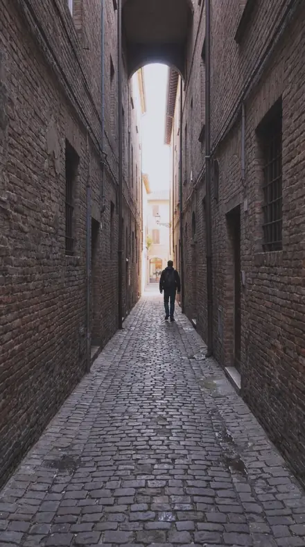

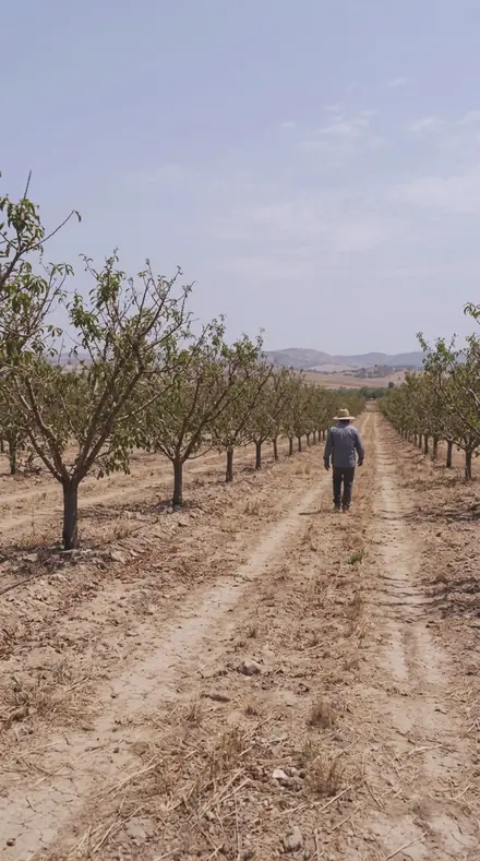

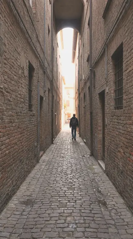

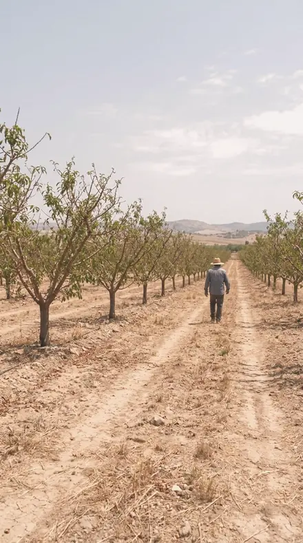

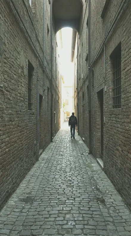

Every collection here is built the same way. It names a hue, deepens it, pulls the neighbours on the wheel into it, and keeps the orange band where faces need it. The baseline states the scheme; the full statement adds a matching midtone grade; the mildest member is safe on anything. In between, one preset per lever: saturation, luminance, tint, the vignette, the black lift.
Warm earth. Copper Rose turns red toward pink and lifts it, magenta folded in, so blush reads as copper rose and not scarlet. Ochre Field deepens yellow toward sand and drags green with it, blues held down so nothing cool competes. Rust Iron takes red down to oxide and folds magenta into it, with skin kept off the same path.
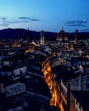
Cool. Slate Blue deepens blue and folds aqua and purple into it, faces held warm inside the cold; Steel Rail is what makes it slate instead of sky. Plum Dusk steers blue and magenta into violet, a palette almost nothing else offers, with Orchid Throat the safe member for people.
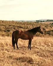
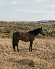
Green and neutral finish the sheet. Moss Olive pushes green toward yellow and deepens it, the faces lifted so they read against the dark. Sage Room lightens green and drains it to grey-green, the room reading calm before the objects do. A couple of swatches from each are below, on the same frames.